
To the Max
Academic Project – Packaging
Scope: Packaging Design, Brand Identity, Print ProductionTools: Photoshop, Illustrator, InDesignTo the Max is a fictional tea brand developed during the COVID-19 pandemic, when sleep schedules shifted and many students and young adults became more productive at night. The brand positions tea as a flavorful, caffeine-forward alternative to coffee, highlighting its energy-boosting qualities in a playful, culturally relevant way.
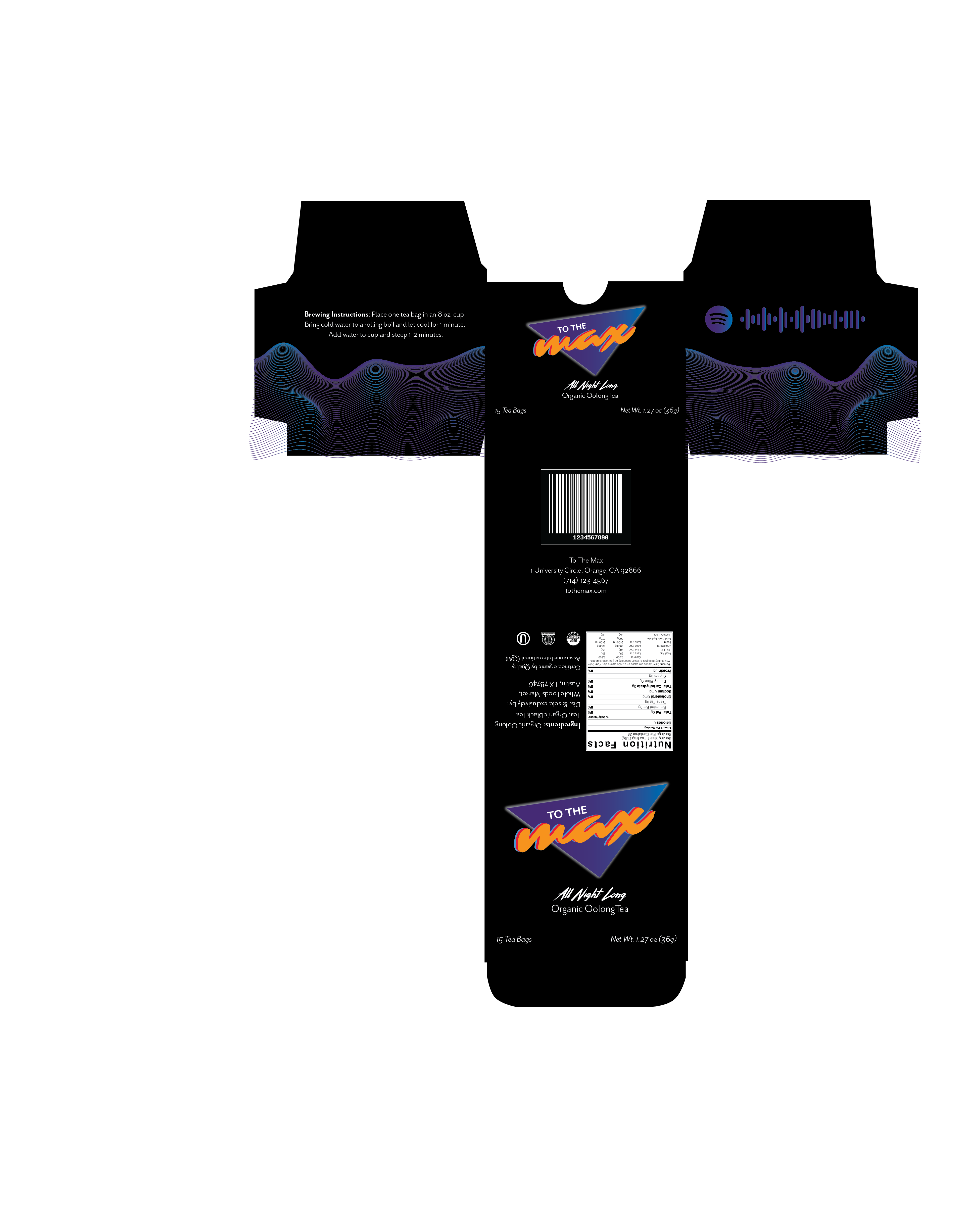
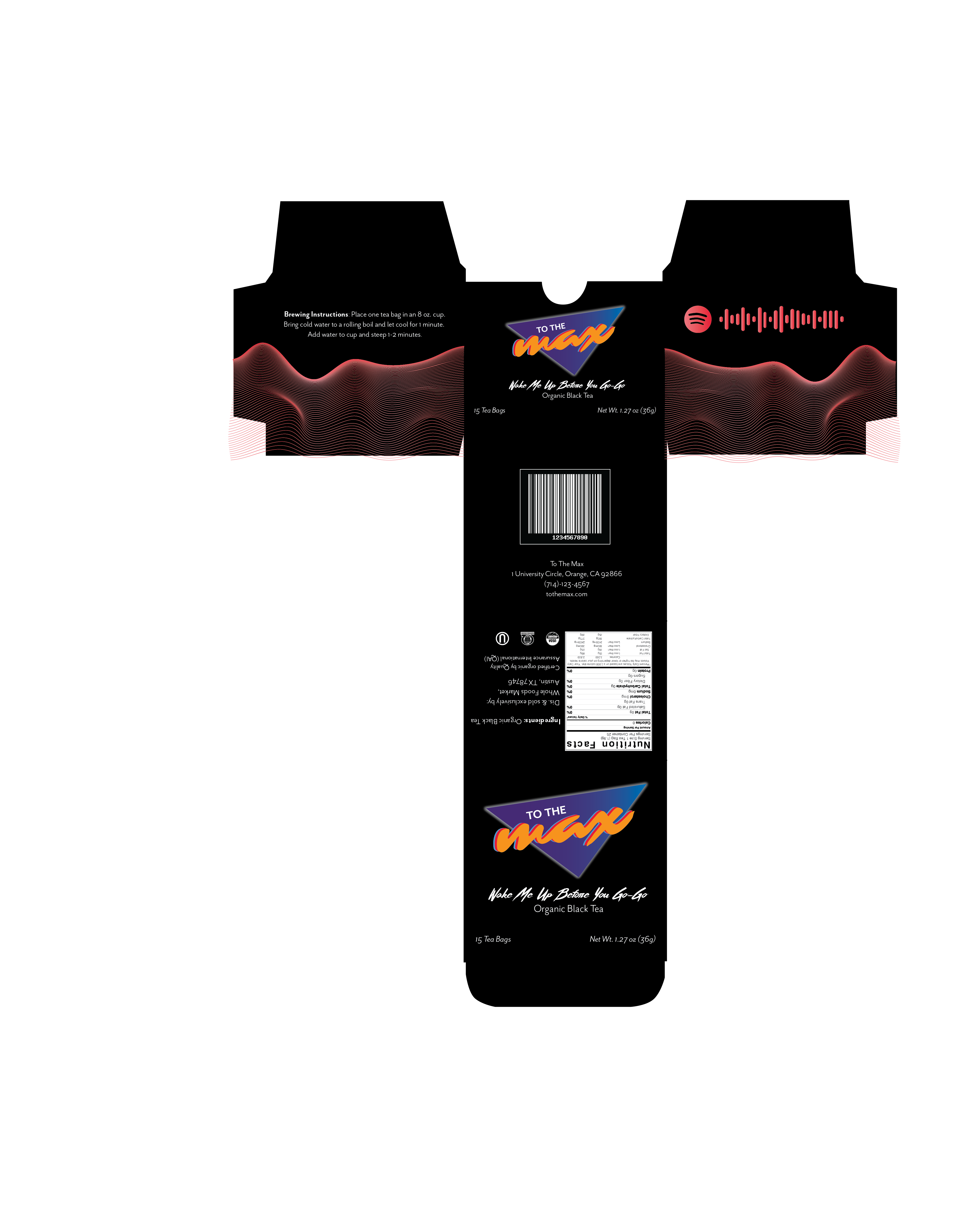
The product line was designed as a boxed series for Whole Foods Market, featuring six flavors inspired by iconic song titles: Wake Me Up Before You Go-Go, Under Pressure, Walking on Sunshine, 9 to 5, Sweet Dreams (Are Made of This), and All Night Long.
The goal of this project was to develop a cohesive brand identity and packaging system that communicates energy, rhythm, and personality while remaining shelf-ready for retail. The visual system blends bold typography and vibrant color palettes to reflect both caffeine-driven momentum and music-inspired storytelling.
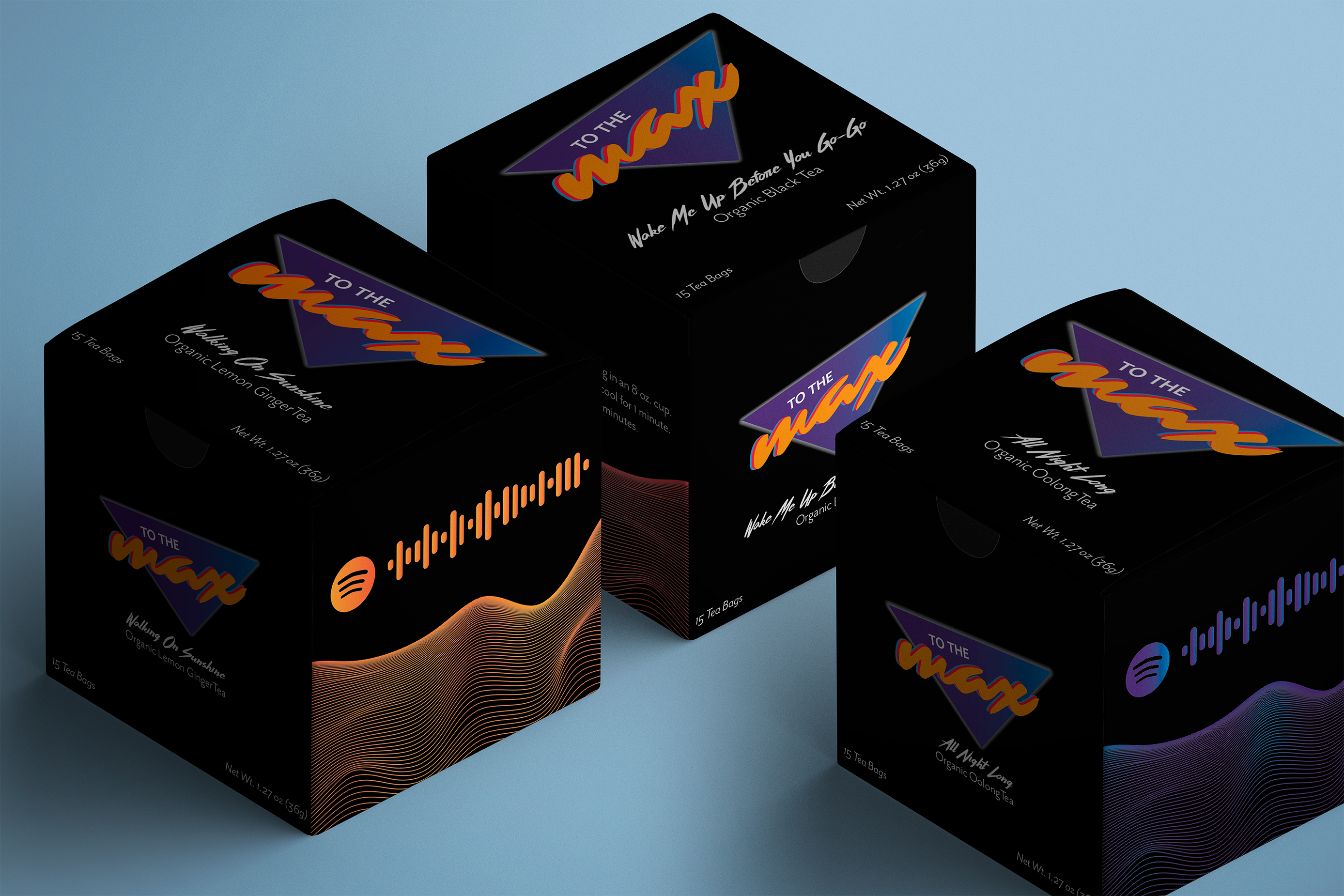

Designs for three of the flavors, showcasing the packaging
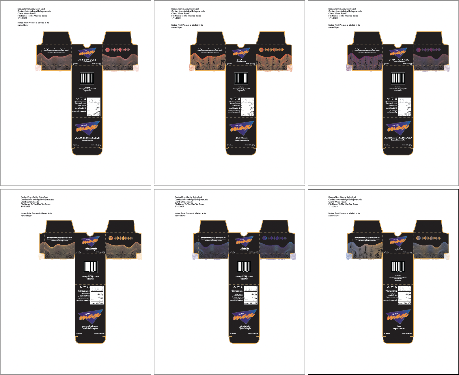
Print processing documents for all six flavors